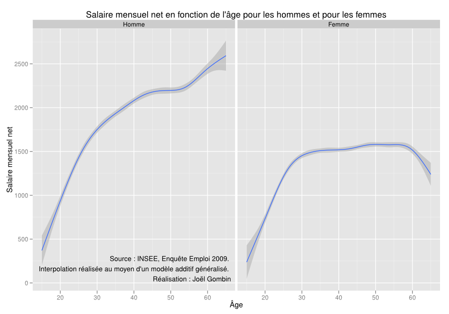
Wage inequalities
The idea for this graph came from a R user group that was held in INSEE. The speaker was presenting ggplot2, and as an example he showed the graph I’m presenting here. I found it particularly striking, and so I wanted to duplicate it. By the way, I’ve been told that activists for coeducation used it for a slideshow in high places…
The data used is the ‘Enquête Emploi’ survey by INSEE, 2009 version. The variables of interest are quite simple really: gender, age and ‘monthly net wage, adjusted for missing answers’ (SALRED variable).
The data used and the R code is in a github repository.
So, here is the graph: